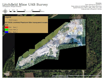
Tuesday, December 12, 2017

Lab 12: UAS Data Processing with Ground Control Points

Introduction

In Lab 10, the UAS data collected in Lab 3 was processed in Pix4D without the use of Ground Control Points (GCPs), and had datum errors. GCPs help to improve the spatial accuracy of the data. They are visual markers, as described in Lab 3, that are surveyed so that the exact spatial coordinate is known. Aerial photographs will capture GCPs whose coordinates can be used like a push pin to tie the image to the selected datum. In this lab, the UAS data from lab 3 is processed with GCPs in Pix4D. 

Pix4D Tutorial

Using Pix4D with Ground Control Points is a very similar process as running without, except GCPs need to be added and verified. I created a new folder for this lab, and executed a "Save As" to that folder so that the initial processing data was not lost.

I then opened the GCP Manager by clicking on "Project" and "GCP/MTP Manager" which opens the window in Figure 1. On the right side of the window, I clicked "Import GCPs" to import a table of the coordinates for each GCP. In lab 3 each GCP was surveyed via a variety of Global Positioning Devices. The data set used in this lab was collected with the Trimble and massaged before use. This action populated the GCP/MTP Table. Notice that the left-most column is populated with zeros, denoting that each coordinate has not yet been paired to any images. The values in this column should be at least 2 before reprocessing the data. On the bottom of the window, I clicked "Basic Editor..." which allowed me to manually click on each GCP in each image. With this process, I effectively "pinned" each image to a datum.

Figure 1: GCP/MTP Manager
Once the tedious task of identifying GCPs is completed, the GCP/MTP manager can be closed and the project can be reoptimized for GCPs. On the upper ribbon, click "Process" and then "Reoptimize." The data can now be processed. On the lower Processing Ribbon, make sure that 1. Initial Processing is NOT checked, this is an unnecessary task that will consume a lot of time. 2. Point Cloud & Mesh and 3. DSM, Orthomosaic, and Index should be checked so that a DSM and Orthomosaic can be produced. This will take a lot of time.

Data Discussion

With the use of GCPs, the Digital Surface Models and Orthomosaic are more spatially accurate than without. Figure 2 shows the improvement of horizontal accuracy when GCPs are used to create the DSM. I used "Spatial Accuracy" feature class created in Lab 11 by delineating the leftmost side of major roads near the mine site to compare the spatial accuracy of the two Orthomosiacs. Figures 3 and 4 show the greatly improved vertical accuracy of the Digital Surface models. Recall in Lab 11 it was discussed that the DSM without GCPs put elevation between 80 and 105 m AMSL, when the true elevation is approximately 234m AMSL. In ArcScene DSM with GCP and DSM without GCP were both displayed in the same viewer. There is a large visual gap between the two.

Figure 2: Spatial accuracy of Orthomosaics. Left: Orthomosaic generated with GCPs overlain by "Spatial Accuracy" feature class, perfectly delineating the leftmost side of major roads near the mine. Right: Orthomosaic generated without GCPs overlain by "Spatial Accuracy" feature class which does not line up as it should.

Figure 3: Vertical Accuracy of DSMs Oblique View

Figure 4: Vertical Accuracy of DSMs Crossectional View

A secondary educational goal of lab 3 was to test the accuracy of cell phone GPS. Figure 5 shows a site map of all 16 GCPs collected with Trimble. Figures 6 and 7 zoom into sites 6 and 7, respectively, comparing GCP coordinates collected with Trimble, Topcon, Bad Elf GPSs, and Cell Phones. You can see that Trimble and Topcon are right on top of the GCP cross hairs, but the Bad Elf and Cell Phone data is less accurate, up to 8meters away from the correct location.

Figure 5: GCPs collected with Trimble

Figure 6: GCP Collection Comparison at GCP no.6

Figure 7: GCP Collection Comparison at GCP no.7

Conclusion

The real world purpose of collecting and processing this data is to eventually be able to calculate the volume of stockpiles at the mine. Volume is a product of basal surface area and height, and thus depends greatly on the spatial accuracy of elevation and surface area data. Based on the two tests conducted, GCPs significantly improved the horizontal accuracy, vertical accuracy, and overall quality of the data. To conduct UAS surveys with integrity, one should always use ground control points.

Pix4D made it relatively easy to add GCPs, verify them, and process the data, as long as the GCP data was well maintained and organized. This exercise was a good reminder to manage data properly. 

Monday, December 11, 2017

Lab 11: UAS Data Processing without Ground Control Points

In lab three our class went out to Litchfield Mine and collected UAS data from a variety of platforms. This lab uses Pix4D software to process that data without Ground Control Points to generate a point cloud and digital surface model (DSM).

Overview of Pix4D

What is the overlap needed for Pix4D to process imagery?
The amount of overlap needed to process imagery properly depends on the type of terrain mapped, and will determine the rate at which images are taken. In general, the more overlap the better. As a  rule of thumb, the recommend amount of overlap is at least 75 percent frontal overlap and 60 percent side overlap.

What if the user is flying over sand/snow, or uniform fields?
In the special cases where you are processing data of sand and/or snow, or even flat terrain and agricultural fields, Pix4D recommends at least 85 percent frontal overlap and 70 percent side overlap.

What is Rapid Check?
Rapid/Low Res check is a Processing Template that produces fast results at a low resolution, working as an in-field indicator of the quality of the dataset. If the processing results are poor, the data set is also poor and the images should be recollected.

Can Pix4D process multiple flights? What does the pilot need to maintain if so?
Pix4D can process multiple flights, but the pilot must maintain enough overlap within each flight and among the flights, be collected under similar conditions (sun direction, weather conditions, etc.) and maintain a similar flight height.

Can Pix4D process oblique images? What type of data do you need if so?
Pix4D can process oblique images, in fact they are recommended for recreating buildings. It is strongly recommended to use Ground Control Points or Manual Tie Points to properly adjust the images.

Are GCPs necessary for Pix4D? When are they highly recommended?
GCPs are not necessary for Pix4D, but are highly recommended for processing oblique images or when combining aerial nadir, aerial oblique, and/or terrestrial images.

What is the quality report?
After processing data, the quality report is produced detailing how the process went. It will include a detailed quality check of the images, dataset, camera optimization, matching, and georeferencing. It generates a preview of the image, shows initial positions, computed image GCP positions, absolute camera position and orientation uncertainities, 3D points from 2D keypoint matches, geolocation details, and processing options.

Pix4D Walk Through

Getting Started

Before opening Pix4D, create a folder to work in and store all your results. I created a folder named "Pix4D" in my Q drive.
Then I opened Pix4D and clicked on "New Project". A new project window popped up prompting me to select a name for the project and file to store all generated data in. I named my project following a naming scheme that included the date the flight occurred, site location, UAS platform or sensor name, and flight altitude. I saved the project in the "Pix4D" folder I just created in my Q drive. Click next.
The next page prompted me to select images to be processed. After reviewing all images for quality, I selected all images collected that day from the Phantom and added them. It is important to review image properties for accuracy. For example, the the camera is listed as having a global shutter. The camera used to collect the data however does not have a global shutter. I manually changed that designation to "Linear Rolling Shutter." Click Next.
The next page prompted me to select the output coordinate system, which I left in default. Click Next.
For a processing Template, I selected 3D maps. Click "Finish."

Processing Data

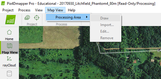
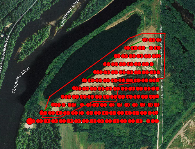
On the main screen, I can see basemap imagery around the location the data was collected, overlain by the data collected in the form of a red dot for each location an image was taken.To speed up processing, I drew a polygon around the actual mine, cutting out the forested area I do not care about for this project. To accomplish this, I clicked "Map View" on the upper ribbon, then "Processing Area," and finally "Draw (see figure 1)." This tool allowed me to delineate the area I wanted processed, as seen in figure 2.

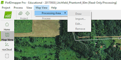
Figure 1: Delineate Processing Area
"Map View" > "Processing Area" > "Draw"


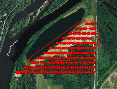
Figure 2: Delineated study area. Almost half of the images are collected over a forested area that are irrelevant to the purpose of finding the volume of mine stock piles. A study area line is delineated around the mine area. Only images collected within this area will be processed. 
On the bottom left corner of the window, I clicked "Processing" which opened a mini window at the bottom of the page. I unchecked "2. Point Cloud and Mesh" and "3. DSM, Ortho and Index" leaving only "1. Initial Processing" checked. Once initial processing is complete, I will review the Quality Report to determine if the data set is good enough to continue processing it further. The initial processing will take some time to complete.

When initial processing is complete, view the "Quality Report." If the results are good, you can completely process the data. Uncheck "1. Initial Processing" and check "2" and "3, as seen in figure 3.  When this processing is complete, another "Quality Report" is produced.

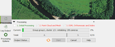
Figure 3: After Initial Processing checks out, create a point cloud mesh, DSM, Ortho, and Index.


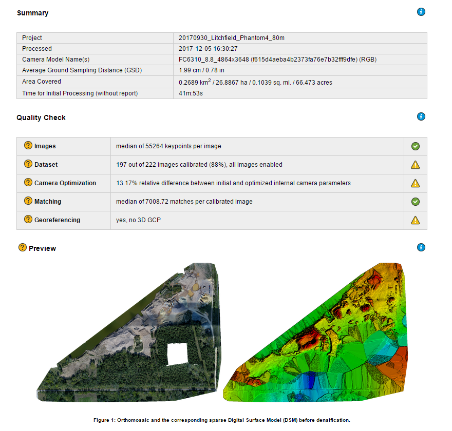
As seen in figure 4, 197 out of 222 images were used. The 25 that weren't were probably the images collected over the water body which are difficult to process. Overlap around the edges are poor, because less images are collected on the edges than in the middle of the processing area.

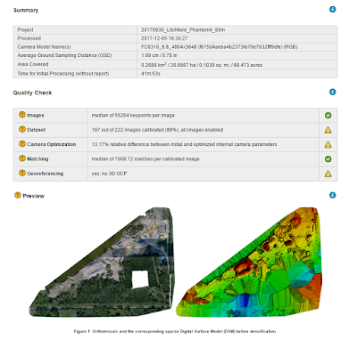
Figure 4: Quality Report Summary.
On the left ribbon of the viewing area, I clicked "rayCloud" and checked Triangle Mesh (see Figure 5) to view the data (Figures 6-8).
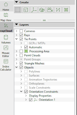
Figure 5: RayCloud
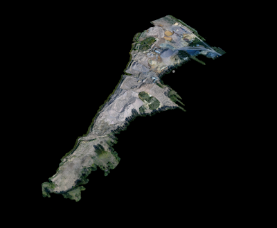
Figure 6: Overview of data processing results. 

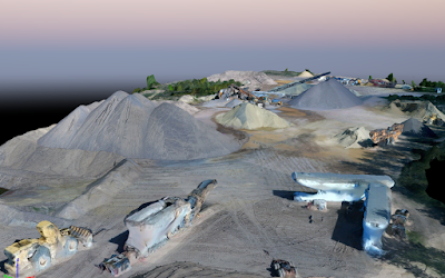
Figure 7: Data processing result demonstrating 3D nature.

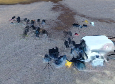
Figure 8: Representation of our class looks like an frame from The Walking Dead.

Map Results

This process produces some visually stunning images, but without GCP's the data is not spatially accurate. In figure 9 I demonstrate this by drawing a red line on the east-most side of two major roads at the mine site that don't change with time. When this feature class is laid over the Phantom 4 raster file at the mine site, you can see that the roads do not line up. Figure 10 is a screenshot from Elevation Finder (input coordinates 44.77495, -91.57188) showing that the approximate elevation at the site of mine to be about 234 meters AMSL, a significant difference from the 80-100 meters AMSL elevation reported by the Digital Surface Model created without GCPs (Figure 12). Figures 11 and 12 display the Orthomosaic and Digital Surface Model created.
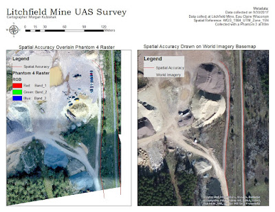
Figure 9: Need for Datum. Right: Spatial Accuracy file draw on basemap. Left: Spatial Accuracy Overlain Phantom 4 Raster Data demonstrating spatial inaccuracies.

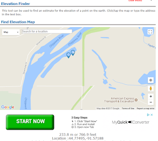
Figure 10: Elevation Finder reports average elevation at the mine site approximately 224 meters.


Figure 11: Orthomosiac

Figure 12: Digital Surface Model

Final Thoughts

My overall impression of Pix4D is that the program is relatively user friendly and creates incredible products out of the data provided. In this lab that products were not very spatially accurate because no GCPs were used. In the next lab, I will process the same data using 16 GCPs which should correct inaccuracies. This data takes a lot of time to process, so I appreciated the detailed progress bar that broke up progress into 15 segments. The summary produced after processing was very helpful, but I wish that like ESRI products the summary was hyperlinked to websites that could provide more detailed information about what the results mean.

Monday, December 4, 2017

Lab 10: Visualizing Sandbox Survey

Introduction

Lab 10: Visualizing Sandbox Survey builds upon the work that began in Lab 1: Sand Box Lab. Recall that sand in the sand box was shaped to spell out "JOE" with the J a trench and the O and E raised hills, as shown in Figure 1. The area was systematically sampled in cm, with the cross strings raised above it as 0cm. In this lab, the data collected in Lab 1 is normalized and interpolated to create a series of digital elevation models (DEM). This will inform various methods of DEM creation and the accuracy of the sampling method.

Data normalization with regards to geographic data involves the process of organizing, analyzing, cleaning, data so that it can be as efficient as possible (ESRI Definition). It is important that the data collected in Lab 1 is normalized because one incorrect elevation value can greatly alter the values of interpolated cells near it.

Figure 1: Sand Box

Methods

The first step of good data management is creating a folder for the project, in this case named "SandBox," as well as a file geodatabase, also named "SandBox" in this case. I brought the normalized sandbox data into ArcMap with an excel table and added the geographic data with the "add X, Y data" option. This created a shapefile, shown in Figure 6. Using interpolations methods Inverse Distance Weighted (IDW), Natural Neighbors, Kriging, and Spline several digital elevation models were created. I also created a TIN.

Inverse Distance Weighted

According to ESRI, the IDW tool assumes that things in close proximity are more alike than things far away, and weights the closer points more highly. Figure 2 shows seven iterations of IDW with different parameters. I adjusted the power parameter, which reduces the influence distance points have, and the number of points use to create each new point. IDW 10 is the default parameters of power 2 and points 12. IDW 4.2 used parameters power 3 and variable points 8, and I think best represented the sandbox terrain.


Figure 2: IDW Experimentation

Natural Neighbors Interpolation

According to ESRI, the Natural Neighbors Interpolation method uses a defined number of the closest inputs to define a new query point. With this tool there were not many parameters to experiment with, so Natural Neighbors 1 is the default with cell size 0.39, and Natural Neighbors is cell size 0.45, which didn't make much of a difference in appearance.  

Figure 3: Natural Neighbors Experimentation

Kriging Interpolation

According to ESRI, Kriging Interpolation assumes that the distance and direction between sample points creates a spatial correlation. The tool fits a mathematical function to the points based on this relationship to determine the output values for each location. This tool is often used in soil science and geology, especially when there is a spatially correlated distance or directional bias in the data.

Figure 4:  Kriging Interpolation Experiments

Spline Interpolation

According to ESRI, the spline tool creates a surface that passes through the data points (Figure 6: Raw Input Data) exactly and minimizes curvature. It accomplishes this by passing through all sample point, and fitting a mathematical function to a specific number of closest input points for the space in between the points. This method tends to best suit gently varying surfaces like elevation, water tables, or pollution concentrations.

Figure 5: Spline Interpolation Experimentation

TIN

Triangular Irregular Networks (TIN) are made up of vertices that are connected by a series of edges, together forming a network of triangles. ArcMap supports Delaunay Triangulation method of interpolation, which utilizes distance ordering.

Figure 6: Raw Input Data and TIN Model

Results

Displayed are the best products of Inverse Distance Weighted Interpolation, Natural Neighbors, Kriging, Spline, and TIN processing. Surface models were imported to ArcScene and viewed at an oblique angle to visualize elevation in 3D. Images were exported as a 2D EMF file. The scales remain true to measured values: all a negative distance from an arbitrary "0" elevation height above the sand box. High elevations are approximately -7cm, usually displayed with white colors, and low elevations are about -21cm displayed with dark grey and black colors.
Figure 7: IDW with power 3 and 8 variable points.
Figure 8: IDW Oblique view


Figure 8: Natural Neighbor with default inputs. Produces a smoother output than IDW.
Figure 9: Natural Neighbor oblique view.

Figure 10: Kriging Interpolation with settings ordinary, exponential. Seemed a little blurry.
Figure 11: Kriging Interpolation oblique view, image does not seem blurry.


Figure 12: Spline Interpolation with spline type regularized. Well defined letters.
Figure 13: Spline Interpolation Oblique View. Visually pleasing image.


Figure 14: TIN Interpolation with default settings. Challenging to see defined "J".

Summary and Conclusions

The survey conducted in this lab is similar to other field based surveys but on a very fine scale. Both this survey and field surveys depend on an arbitrary "0" elevation level, and require some sort of systematic measurement plan. Equipment for data collection and measurement vary greatly; I would not want to measure the height of a mountain with a meter stick. Additionally, with this survey there were not obstacles such as private property and impassable terrain that could occur when conducting large scale field surveys.

It is not always realistic to perform a grid based survey as detailed as this one. Our survey was conducted on a very fine scale, therefore grid size and data variability were very small and would not be realistic use on any large surface. Additionally, when conducting an elevation survey on a greater scale covering more surface area, time and physical obstacles may prevent measuring data with a fine grid.

These interpolation methods can be used for any continuous raster data such as air or water temperature, water depth, winds speed, geologic unit thickness, depth to bedrock, water table height, aquifer flow rates, and many more.

Tuesday, November 28, 2017

Lab 9: Arc Collector II

Introduction

In addition to being a cheap date excursion, holiday lights cue the holiday spirits, and bring communities together. The city of Eau Claire, Wisconsin has some beautiful light displays put on by homeowners and businesses. A few neighborhoods were toured in this study to inform which homes or neighborhoods to skip, and which ones are a must see. 

Study Area

The study area included parts of the second, third, and fourth wards in Eau Claire. 

Methods

Criteria

Display lights were graded based on the variety of colors, number of decorations (inflatables, stationary decorations), if there were moving parts or flickering lights, if there was music associated with the display, and the overall aesthetic. A geodatabase was set up with domains to accommodate this criteria. Screenshots of the criteria setup are in figures 1-6.
Figure 1: Decorations Domain

Figure 2: Grade Domain

Figure 3: Movement Domain

Figure 4: Music Domain

Figure 5: Notes Domain

Figure 6: Colors Domain. There was an error in generating this domain. The minimum value should have been 1 and the maximum value should have 5.  

Data Collection

The database was shared as a service so that it could be used with ArcCollector. Data was collected around town using the ArcCollector app on a mobile device. Data was only collected at homes with specifically holiday lights/decorations.

Discussion

Conclusions

Lab 8: Priory Navigation Lab


Tuesday, October 31, 2017

Lab 7: Arc Collector

An Introduction to gathering geospatial data on a mobile device, such as a tablet or smartphone

Introduction

Since most people always have a smart phone or tablet on them at all times, using these devices to collect spatial data can be very easy and effective. This lab is an introduction to gathering geospatial data on a mobile device using the App Arc Collector. On October 24, 2017 teams were sent out across the UWEC campus to collect weather data such as wind speed, temperature, dew point, and others. Using ArcCollector, all data was collected with a specific geographic point on campus.

Study Area

Data was collected on the UWEC campus. As shown in Figure 1, the campus was divided into zones. Teams of 2-4 students were sent to each zone. 
Figure 1: Study Area Map


Methods

Dr. Hupy created the private group "Geog336Micro_Section01" on ArcGIS online as well as a survey for the App ArcCollector. This App is described in Lab 5: Using a Bluetooth GPS with an iOS Device. Students downloaded ArcCollector, logged onto ArcGIS online group "Geog336Micro_Section01" to access the survey. 

Students were divided into groups of 2-4 and sent out into different zones on campus to collect weather data in their zone. Criteria collected included Temperature (Degrees Fahrenheit), Dew Point (Degrees Celsius), Wind Chill (Degrees Fahrenheit), Wind Speed (Miles per Hour), and Wind Direction (Azimuth). The first four pieces of data were collected with the Kestrel 3000, as pictured in figure 2. Wind Direction was collected with a flag and Geographer's Compass, pictured in figure 3.

Figure 2: Kestrel 3000

Figure 3: Geographers Compass
Using ArcCollector is fairly simple. Figure 4 shows the map screen, used to determine geographic location. The green dots indicate points where data has been collected and the larger grey dot indicates the current location. To add a data point click the plus sign on the bottom ribbon. This will open the survey screen, figure 5. Using the phone's GPS, the location is automatically recorded. The user must then complete the survey. There was a preset range of inputs to be selected for each field. Once all the fields are completed, click the check mark on the upper ribbon to upload the data. Data is added to the map in real time as it is collected.

Figure 4: ArcCollector Map Screen. Green dots are collected points. Larger grey dot is current location. Plus sign on the bottom ribbon opens the survey pages.

Figure 5: ArcCollector Survey Page. Fill out each field at each location, click the check mark to confirm and upload data to map. 
Once all the data is collected, it can be downloaded from ArcGIS online and represented in ArcMap.

Discussion

Temperature

The lowest temperature values collected on this day are those collected nearest the river. 

Figure 6: Temperature Map

Wind Chill

Wind chill temperatures are coldest near the river where the temperatures are lower and wind speeds are the greatest. 
Figure 7: Wind Chill Temperatures Map

Dew Point

Dew point is the atmospheric temperature below which water droplets begin to condense and dew can form. Dew point varies according to pressure and humidity. Dew point appears to be greatest near the river on the eastern end of zone two. 


Figure 8: Dew Point Map


Wind Speed and Direction

Wind speeds tend to be greater closer to the river. Visually, wind direction trends to the northwest. Statistically, the mean azimuth is 228 degrees, which is to the southwest. However, when looking at the frequency distribution, most values are greater than 250 degrees. The scattering of azimuths collected less than 250 degrees could be due to eddy currents generated as the wind flows around a building.
Figure 9: Wind Speed and Direction Map


Figure 10: Wind Direction Statistics

Conclusions

The lab effectively demonstrated the simplicity of using ArcCollector on mobile devices to collect geospatial data. The smartphone GPS was accurate enough to pinpoint locations, and the survey was simple to fill out and upload. Data was displayed in real time even as data was collected from multiple devices simultaneously. 

Lab 12: UAS Data Processing with Ground Control Points

Introduction In Lab 10 , the UAS data collected in Lab 3 was processed in Pix4D without the use of Ground Control Points (GCPs), and had...